vol.02ポスターのある風景2022年1月21日
海外のポスターインテリアって憧れる!KOZは日本でも素敵なポスターを飾りたくて、デンマークの 「Paper Collective(ペーパーコレクティブ)」というブランドに出会いました。たくさんのアーティストが生み出すポスターは、日本のみならず世界中の人たちに愛されています。どんなポスターインテリアがあるのか、覗いてみましょう!
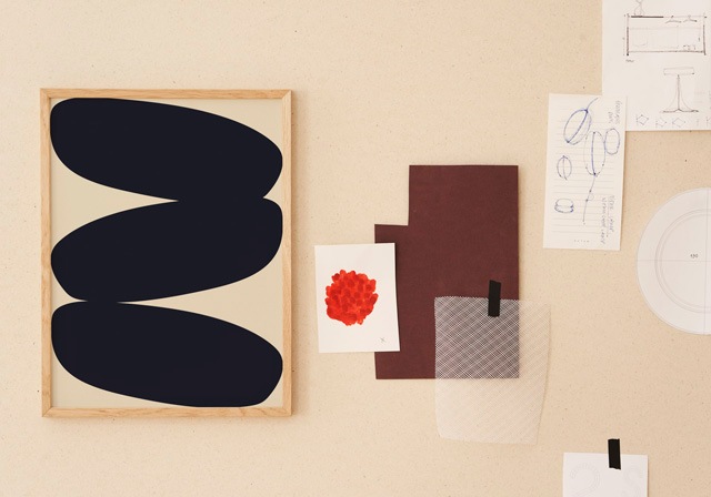
a l i n a a u l b a c h @dekorationess
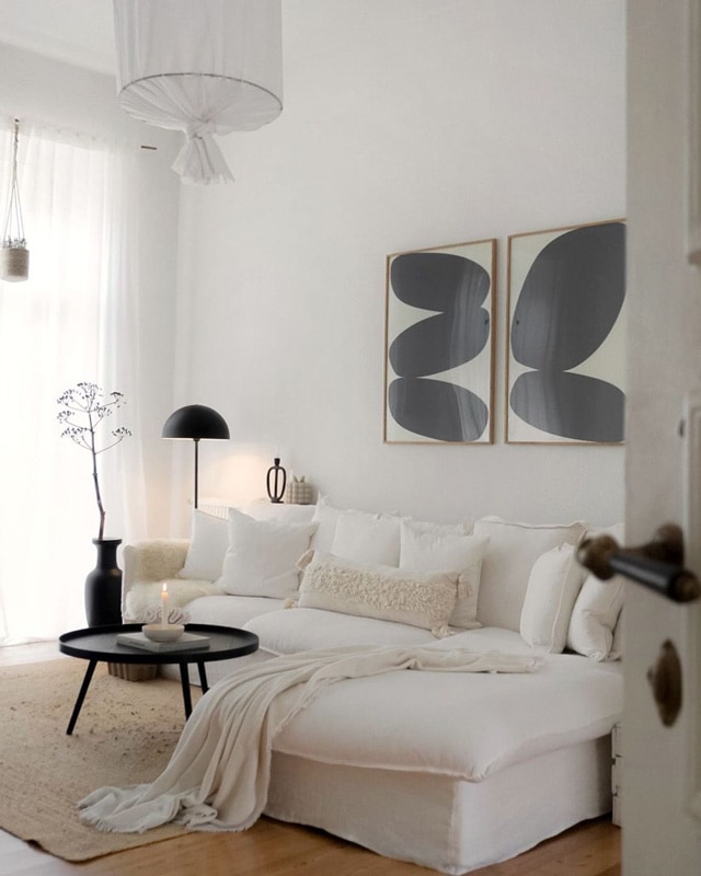
白が基調のフェミニンなインテリア。2枚並べて飾ったSolid Shapesのダイナミックなタッチとのバランスが素敵です!
A white based feminine interior.
The balance with the dynamic touch of Solid Shapes displayed side by side is wonderful!
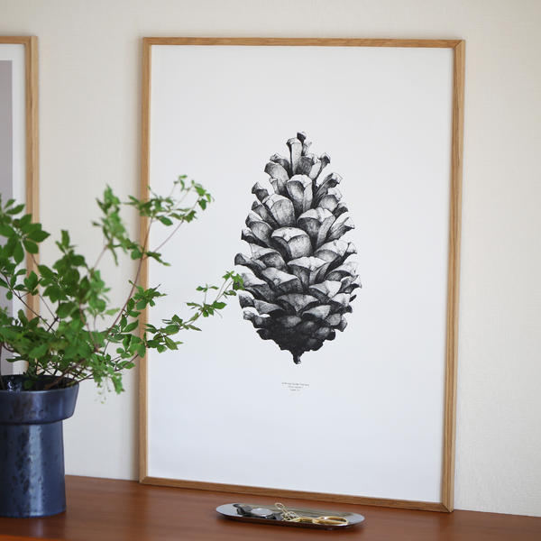
S A N D R A , NL @_s.an__
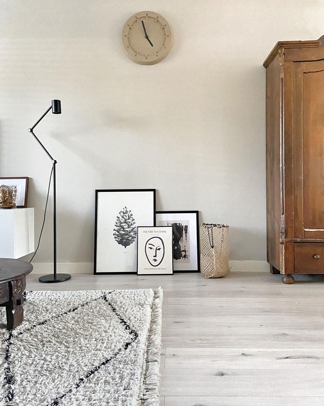
デザイン違いのポスターたちをラフに床に置いて。パインコーンも他の2枚もモノトーンでまとめられているのが良いですね。ブラックのフレームも良いアクセントに!
The posters of different designs are roughly placed on the floor.
The synergy between the Pine Cone poster and the other two monotone posters are well balanced.
The black frame is a nice accent too!
ALEK MODIN @alekmodin
たくさんのポスターと壁の色、家具の質感やフォルムなど、見事なバランスのインテリア!ALEKさんのセンスの良さに脱帽です…
A wonderfully balanced interior with lots of posters, wall colors, furniture textures and forms!
A very difficult balance but we tip our hat to ALEK's great sense of interior taste.
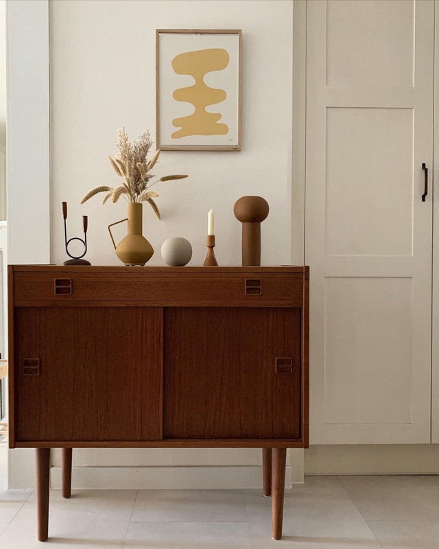
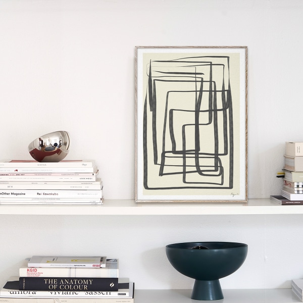
@my_life0302
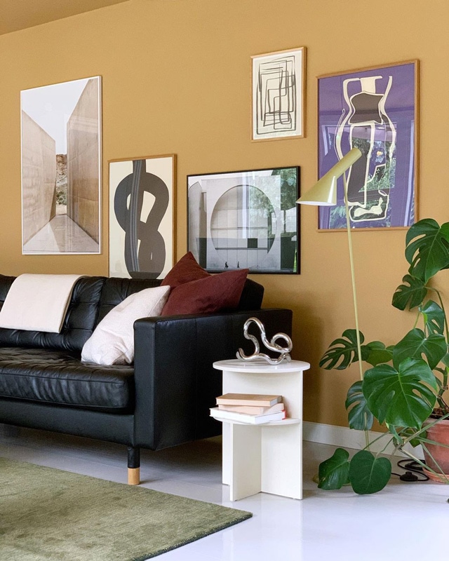
いろいろなイエローのアイテムで作ったフォトコーナー。ユニークなオブジェとポスターが、静かな空間に溶け込みます。
A great color tone of Yellow, beige, brown and natural colors.
Unique objects and posters blend into a quiet space. Very smooth.
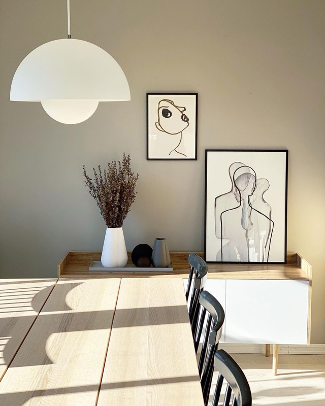
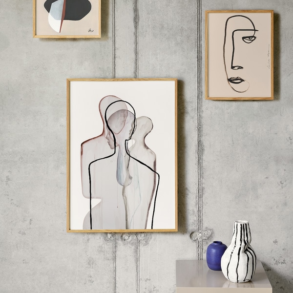
T O R U N N @torunnmyh
イラストポスターを2枚飾った、すっきりとしたインテリア。イラストの柔らかなタッチがやさしい雰囲気を醸し出していますね。
A neat and tidy interior with two illustration posters.
The soft touch of the illustrations creates a gentle atmosphere.
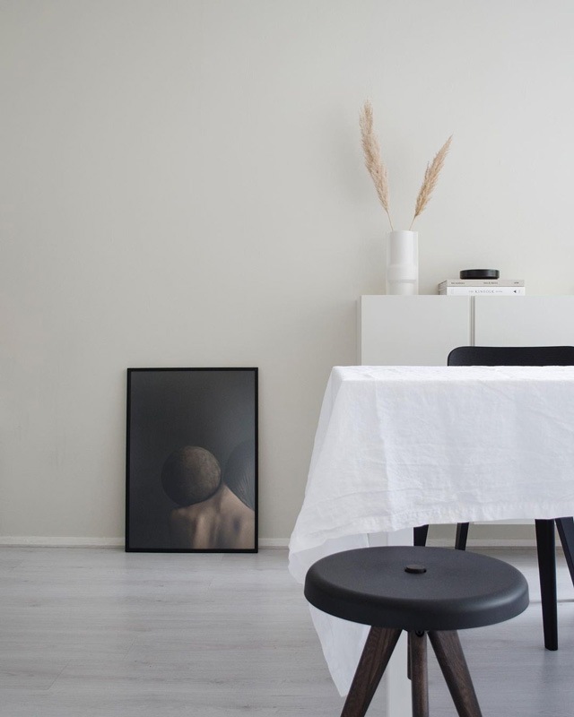
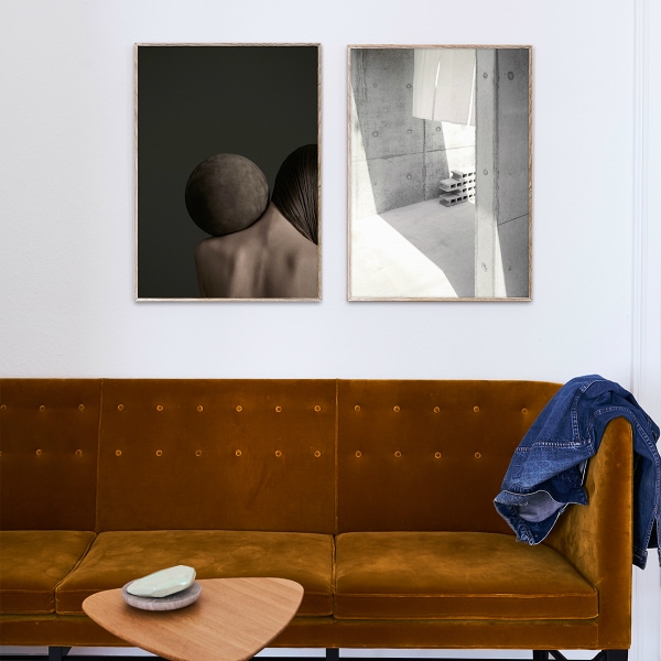
Nikya @nikyaliezen
インテリア雑誌に載っていそうなお部屋!「Close Contact 01」のポスターがぴったりです。余白のある壁とダークなトーンのポスターとのバランスが絶妙です。
A room that looks like it belongs in an interior design magazine!
The "Close Contact 01" poster is perfect for this room.
The balance between the marginal walls and the dark-toned posters is exquisite.
ポスターのある風景はいかがでしたか?
日本ではなかなかできない空間の使い方や色使いなどが素敵でした!
ペーパーコレクティブはたくさんのポスターがありますので、
これ!という、あなたの1枚を見つけて、
ポスターインテリアを楽しんでくださいね。
この記事で登場した商品はこちら▼